Facts4COP21

Facts4COP21

#Facts4COP21

In 2010 the world emitted 48 gigatonnes of greenhouse gases. So we decided to start our countdown to the last COP21 plenary 48 days beforehand. Every day until the last day of the Paris climate negotiations in December 2015, we will share an interesting fact from our own number crunching dungeons, and from those of others. The 48 facts touch on key negotiation items at COP21. Please share! Look out for #Facts4COP21 announced daily via our twitter account @ClimateCollege.

PS: After the tragedy of human suffering inflicted by other humans, we have changed our hashtag from #Facts4Paris to #Facts4COP21. The attacks in Paris on 13th November 2015 warrant different kinds of "facts" to be disseminated. Facts about a tolerant society, about a free society, about the differences between ISIL and Islam and about the root causes of terrorism. We do not have those facts. We hope that our facts can however be useful for another struggle of humanity: long-term climate change.

Facts4COP21: Paris Agreement includes ambitious long-term goal

The Paris Agreement writes history. The Agreement strenghtens the temperature goal from "below 2°C" to "well below 2°C" and to pursue best efforts to limit warming to 1.5°C. Less in the headlines, but of equal importance is the translation to emission goals.

Article 4 is the crucial one in regard to emissions. It says that "In order to achieve the long-term temperature goal set out in Article 2, Parties aim to reach global peaking of greenhouse gas emissions as soon as possible, recognizing that peaking will take longer for developing country Parties, and to undertake rapid reductions thereafter in accordance with best available science, so as to achieve a balance between anthropogenic emissions by sources and removals by sinks of greenhouse gases in the second half of this century, on the basis of equity, and in the context of sustainable development and efforts to eradicate poverty." 

In our assessment, the Paris Agreement rises to the challenge of limiting dramatic climate change. It sets the framework for a chance to limit multi-metre sea-level rise in the long-term. Individual post-2020 country targets put on the table before Paris are insufficient to the task of limiting warming to 2°C, let alone 1.5°C. The so-called INDCs have not been enhanced here in Paris (they were never meant to be enhanced here because the main focus was on the global agreement). Thus, there exists a big gap between INDCs and the global ambition needed. This will need to be bridged by upgraded mitigation contributions from countries in the years to come. In this article, we keep in mind those insufficient country INDCs but look at the Paris Agreement itself.

What are the main targets in terms of global mitigation?

The ultimate objective of the Agreement is to limit global warming to well below 2°C, and "to pursue efforts to limit the temperature increase to 1.5°C above pre-industrial levels".

There is also a long-term greenhouse gas emission goal. It is to peak global emissions as soon as possible, then reduce rapidly, and achieve net zero emissions "in the second half of the century". These "net zero" emissions are expressed as the "balance between anthropogenic emission by sources and removals by sinks". This basically means that any greenhouse gas emissions remaining in the second half of the century need to be outweighed/compensated/balanced/offset (take your pick) by anthropogenic actions to enhance the uptake of CO2 through afforestation, biomass, carbon capture and storage, and other negative emissions techniques.

Does the Paris Agreement refer to "natural" sinks?

No, clearly not. First of all, as in "international aviation and maritime transport", "international" refers to both "aviation" and "maritime transport". Thus, the adjective "anthropogenic" refers to both "emissions" and "sinks". Furthermore, Article 4 of the UNFCCC convention uses the standard term "anthropogenic emissions by sources and removals by sinks" clearly as referring to anthropogenically induced sinks - otherwise the UNFCCC Parties would have reported incorrect data for the last 23 years. In the hypothetical case that you might interpret it differently, Art. 4 would imply a stabilisation of concentrations, which would NOT be in line with the "best available science" given that we need reducing concentrations to stabilise temperatures over the couse of this century.

Summary in graphs:

In a summary graph, the Paris Agreement contains two temperature goals and two long-term emission goals. 

(download as slides here, or high-res PDF here). A simpler graph of what the Paris Agreement concluded:

(Feel free to use these graphs; just cite as: M. Meinshausen, Australian-German Climate & Energy College, The University of Melbourne, climatecollege.unimelb.edu.au, download as slides here, or high resolution PDF )

How does that language of "balance between emissions and sinks" differ from "net zero"?

Well... substantially, it does not.

A balance between a positive and a negative thing means that both parts are of equal magnitude and hence the sum is zero. However, in terms of communication and framing, they may be very different.

The "balance" language places an emphasis on the "sinks".  We would argue that this emphasis is not ideal, as the enhancement of sinks via large-scale afforestation and biomass production can come with substantial risks in terms of food security and biodiversity. The "net zero" language puts an emphasis instead on the "zero". This stresses that the most important and first task is to reduce emissions to zero.

Nevertheless, whatever the expression, the substance of reducing all greenhouse gas emissions to zero is ambitious, clear and appropriate in light of collective temperature target. 

How does the Paris Agreement compare to the G7 agreement in Elmau?

Arguably, the Paris Agreement target is much stronger than the G7 agreement. The G7 agreement aimed at a "decarbonisation over the course of the century". That can actually mean lots of different things.

Optimistically seen, it means that net CO2 emissions in the energy and industrial sector are phased out by 2100 with a transition to that point. The Paris Agreement has both a potentially closer timeframe ("in the second half of the century") and a broader scope (all greenhouse gases, rather than only CO2). For all greenhouse gas emissions to go to net zero, CO2 emissions have to becomes negative. Negative CO2 emissions are the uptake of CO2 from the atmosphere in growing trees and biomass. However, "negative" methane or nitrous oxide emissions are hard to imagine. Thus, the only way to have net zero greenhouse gas emissions is to have negative CO2 emissions. In order to get from today's high CO2 emission levels to negative emission levels, we first have to go through zero. The Paris Agreement therefore implicitly includes a stronger decarbonisation target than did the G7 agreement.

A look at Figure SPM.7 in IPCC Working Group 3 from the Fifth Assessment Report clarifies some things.

The bunch of scenarios analysed in this Figure aim at 450ppm CO2 equivalence concentrations. One can see that a full decarbonisation of the electricity sector occurs by 2050. Those 450ppm scenarios are roughly speaking the "below 2°C" scenarios.

This makes it clear that full decarbonisation is part of the story no matter what, but even more so if we wish to stay "well below 2°C" and at "1.5°C".

Malte Meinshausen & College

Last updated: 15 Dec 2015
Facts4COP21: Coal is yesterday's hero

No more coal power plants

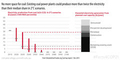
If we want a reasonable chance of staying within 2°C, we can't build any more coal-fired power plants. 

New analysis of coal power plant data by CoalSwarm (see their Coal Plant Tracker here) in collaboration with the ClimateActionTracker.org team shows that the carbon budget leaves no room for new coal power plants. The report looked at IPCC AR5 scenarios that allow a chance of staying below 2°C. It found that under all these scenarios, electricity production from coal power plants (without carbon capture and storage) is much lower than the remaining coal power plant stock. Either current plants need to be switched off, or their load factors reduced.

In the graph above, taken from the Climate Action Tracker Coal Gap report, the grey bar on the right shows the energy from coal power plants already in operation, under construction, approved and announced. The thin red lines on the left side show, for the range of scenarios (10th and 90th percentile), the electricity production from coal consistent with the IPCC AR5 scenarios for 2°C. The grey dashes are the median values. From 2030, in even the most lenient of circumstances (the top of the red line) there's clearly no room for new coal and existing coal plants will need to be pared back. From 2050, coal-fired power needs to be completely phased out.

Facts4COP21: Carbon price average is $7/t while consumption subsidy average is $115/t

Subsidies versus carbon price

The IEA Special World Energy Outlook Report 2015 on Energy and Climate Change contains a number of interesting points.

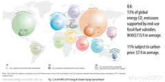
On page 24, Figure 1.2 illustrates for selected regions:

  • the volume of energy-related CO2 emissions;
  • the percentage of energy-related CO2 emissions that are covered by a carbon price;
  • and the percentage of energy-related CO2 emissions that are covered by end-use consumption subsidies (any production subsidies would be additional to these).

The picture tells a sober story. Globally, 13% of energy-related CO2 emissions are supported by some end-use fossil fuel subsidy, at an average rate of $115 per tonne. At the same time, only 11% of energy-related CO2 emissions are subject to a carbon price, and that price is, on average just $7 per tonne.

Why would we expect global emissions to follow a downward trajectory when end-use fossil fuel subsidies have a broader coverage than carbon prices and a sixteen-fold higher dollar tag?

Of course, the picture is regionally diverse; end-use subsidies mainly occur in the Middle East and poorer countries.

What can we learn from all this? Firstly, careful gradual policies are needed to get rid of subsidies, keeping in mind the social aspects of energy poverty (for example, in cases where those end-use subsidies can help farmers get their produce to the next town). Secondly, the co-benefits of addressing end-use energy subsidies can be tremendous. If renewably sourced energy can, for example, provide rural electrification (and thus allow our farmer to use an electro-scooter), there can be benefits for governmental budgets, availing more resources for health and education.

Of course, the overall picture is more complex. In practice, many subsidies do not address the needs of the poor. Furthermore, there have been decades of fossil fuel subsidies on the  production side as well.

For the climate, as long as on a global scale CO2 emissions receive more subsidies than they face prices, it is no surprise that we have not yet started on the necessary downward trajectory. But there are good opportunities to help get us there.

Facts4COP21: Global LULUCF emissions now zero and promise to stay that way.

Global LULUCF

Time for some motivating news...

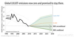
Globally aggregated land use, land-use change and forestry (LULUCF) emissions and removals have come down substantially over the last years.

In 2010, LULUCF emissions were around zero. Although it should be noted that this might be a little deceptive because countries account for the removal of CO2 in forest management systems and elsewhere, whereas carbon cycle models classify this as natural CO2 uptake.

Projections of business-as-usual LULUCF emissions were not looking great. Even before the INDCs came out, projections conitnued to show an increase. But now that the INDCs are in, the LULUCF emissions trend is looking much better.

All the unconditional INDCs taken together suggest that LULUCF emissions remain at around net zero emission levels.

If the conditional LULUCF mitigation actions are supported and implemented, another 0.8 GtCO2eq/yr net uptake per year could be gained.


Source: The recently released JRC LULUCF report by Grassi & Dentener, available here: http://publications.jrc.ec.europa.eu/repository/bitstream/JRC98451/jrc%20lulucf-indc%20report.pdf

Facts4COP21: Inflated baselines make some INDCs seem more ambitious

Indonesia and Turkey use exaggerated baselines

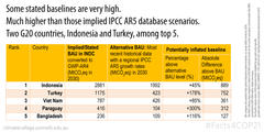
For developing countries, INDC targets are often expressed as reductions with respect to projected business-as-usual (BAU) emissions. That is, these countries intend to reduce their emissions compared to what would have happened under a scenario of 'no climate policy'.

In these circumstances, the chosen BAU projection is highly relevant. In some INDCs, the BAU is explicitly stated, in others it is merely implied.

For every country that has put forward an INDC target with respect to BAU emissions, we compared the implied or stated BAU emissions trajectory with the BAU emissions trajectory consistent with the most recent historical data and growth rates from the IPCC's fifth assessment report.

We found that Indonesia and Turkey have announced baselines that may be inflated by as much 889 Mt CO2e and 752 Mt CO2e, respectively. 

Paraguay may have inflated its baseline by as much as 300%.

Inflating baselines can lead to 'hot air' being injected into the climate negotiations.

Facts4COP21: Russia and Turkey producing most of the 'hot air' in climate talks

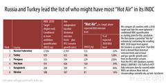
Russia and Turkey have the most Hot Air

Where a country announces an emissions target that sounds like a reduction but actually results in more emissions than under a business-as-usual situation, the emissions are known as 'hot air'.

For all countries, we compared business-as-usual projections of emissions with announced 2030 INDC targets. In every case, where the target was a range (either by design or because of inherent uncertainty) we chose the more ambitious end of the range.

We found that Russia and Turkey have announced targets that result in 533 Mt CO2e and 506 MtCO2e of 'hot air', respectively.

Other 'hot air' countries are Paraguay, Vietnam, Bangladesh and Ukraine. 

Facts4COP21: The current 'optimistic' case shows a G20 emissions 'plateau'

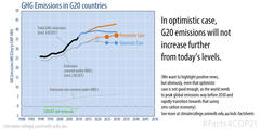
Current best-case scenario does not see emissions rising

As we start COP21 negotiations in Paris today, we wanted to provide a good news story.

Taking all G20 INDC targets, we calculated an emissions trajectory to 2030 for G20 countries. 

In most cases an INDC does not provide a straight-forward target, but a range. This is either by design (such as for Australia where the announced target is 26% to 28% below 2005 levels) or because of unavoidable uncertainties in the calculations.

We chose the more ambitious end of every range and called this the 'optimistic case'. The least ambitious range we called the 'pessimistic case'.

Under the optimistic case, G20 emissions do not increase beyond today's levels. Instead, they seem to plateau. This is the good news.

However, we can't avoid pointing out that a plateau is not enough. Global emissions need to peak well before 2030 and start to seriously decline towards zero...and that's all global emissions, not just those of G20 countries.

Facts4COP21: 95% of the world covered by INDCs... Outstanding: 2% countries, 3% bunkers.

more than 95%

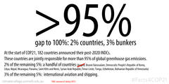
At the start of COP21, 182 countries had announced post-2020 INDCs:155 INDCs, one of which covers 28 EU countries.

Jointly, these 182 countries are responsible for more than 95% of global greenhouse gas emissions in 2010. 

So which countries make up the missing 5%?

  • 2% of the remaining 5% are a handful of countries: Angola, Brunei Darussalam, Democratic People's Republic of Korea,  Libya, Nepal, Nicaragua, Panama, Saint Kitts and Nevis, Syrian Arab Republic,Timor-Leste, Tonga, Uzbekistan, and the Bolivarian Republic of Venezuela. Arguably, some of them (not all) are busy with other pressing issues.
  • 3% of the remaining 5% are international aviation and shipping. Not much of an excuse for these guys.*


* Yes, we know. ICAO and in particular IMO are starting to make baby steps. ICAO's carbon neutral growth pledge is a start, but its starting levels are too high. 

Update: During COP21, Angola announced an INDC.

Facts4COP21: Adaptation financing according to consumption-based emissions: taxing air tickets a close proxy.

air tax piketti2

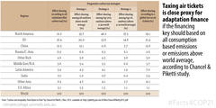
According to a recent study by French economists Chancel and Piketti (author of Capital in the 21st century) taxing air tickets to raise adaptation finance would be easy to implement but may not hit the highest emitters most effectively. Other options might do a better job of this, like focussing on consumption-based emissions and taking contributions from countries whose individuals emit above world average. In these options, those that are most able to afford it and those that contribute most to current and future climate impacts would pay for adaptation. However, these options may be administratively difficult to implement. See more results of the study here.

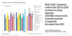
Facts4COP21: Multi-study comparison confirms that global emissions heading in the wrong direction from 2025 to 2030.

WRI comparison

The World Resources Institute has collated and compared all the main global studies that quantify INDCs.

Although there is a fair spread across the individual studies—many providing INDC ranges with low and high values, as well as conditional and unconditional quantifications— there is one trend that is clear across the board. If INDCs are implemented as they are currently stand, emission levels in 2030 are not likely to be below emission levels in 2025. Unfortunately though, emissions trajectories consistent with a least-cost implementation of the 2°C target head downwards between 2025 and 2030; they do not remain constant nor do they increase.

Oh, and on the graph, the first two dark blue bars (labelled: "Australian-German CEC") are our own calculations based on our INDC factsheets (30th October version) available here.

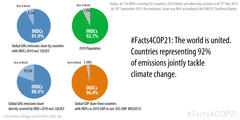
Facts4COP21: INDCs exist for 161 countries responsible for 92% of emissions

92percent

We have updated our INDC Factsheets webpage with the latest submissions (the most recent addition being that of Saudi Arabia).

As of 17 November 2015, 161 countries responsible for 92% of global emissions have submitted INDCs. Those countries account for 93% of the global population and 97% of global GDP.

However, not every INDC covers 100% of a country's national emissions, some exclude certain sectors, for example. We have calculated that around 81% of global emissions are captured by INDCs.

The UNFCCC Synthesis Report, published on 30 October, took account of INDCs submitted by 30 September only. At that time the UNFCCC estimated that countries responsible for 86% of global emissions had submitted INDCs. Our figures update the UNFCCC numbers.

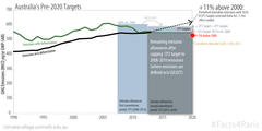
Facts4Paris: Australia could meet its Kyoto pledge while increasing emissions 11% by 2020 relative to 2000.

Australia37ter

The near-term Australian target is a reduction of 5% on 2000 levels by 2020...or so most Australians believe.

In reality the target was established in three parts: an unconditional 5% target; increased to a 15% target if there is a commitment from major developing economies to substantially reduce emissions and for advanced economies to take on comparable commitments; increased to a 25% target if the global agreement can stabilise emissions levels at 450 parts per million or less.

According to the Climate Change Authority, requirements for the 15% target have been met.

But there is a technical point that comes into play here as well. It is such that the actual legal obligations under the Kyoto Protocol are potentially weak enough that Australia may be able to increase its emissions by 11% above 2000 levels and still be in compliance. This all has to do with three factors:

  1. The target under the Kyoto Protocol is not a end-target of 5% below 2000 levels. It is in fact an annual target of reducing emissions by 0.5% (yes: 0.5%) below 2000 levels over the 2013-20 period.
  2. At the end of the first commitment period of the Kyoto Protocol, Australia was left with a large surplus of emission credits (something like 250 to 300 MtCO2eq) that it may choose to carry over. Australia could use these surplus credits over the 2013 to 2020 period under certain conditions (basically they can be used, if emissions are higher than the target).
  3. The third factor may or may not be a factor—this is yet to be determined. It centres on a new clause in the Kyoto Protocol, so-called Article 3.7ter. This new clause says that any target in the second commitment period is capped at average 2008-10 emissions. But there is ambiguity in the interpretation of the word 'emissions'.  Article 3.7ter was inserted into the text of the Kyoto Protocol itself, so it would most likely be defined using the Kyoto Protocol definition. This definition restricts the meaning of 'emissions' to so-called 'Annex A emissions'. Annex A emissions are emissions resulting from fossil and industrial sources only. It does not include emissions from deforestation. This is pretty much standard accounting practice under the Kyoto Protocol. Except that there was an exception negotiated for Australia: since 2008 Australia has benefitted from special treatment allowing the country to include deforestation emissions in its base-year calculations. It is now in Australia's interest to negotiate for 'emissions' under article 3.7ter to be defined as "emissions including deforestation emissions" (see Australia's submission here). If Australia is successful in this, it would be able to increase its emissions linearly from current levels to 11% above 2000 levels by 2020 and still meet its obligations under the Kyoto Protocol. If Australia is unsuccessful, and the term 'emissions' continues to refer to 'Annex A emissions', then Australia will have to keep its emissions constant (at least) until 2020.

Discussions on the definitions of Article 3.7ter may not be the main game in Paris in December, but they will definitely be part of the horse-trading going on in the backrooms.

Update 5th December: That horsetrading has happened now. Australia backs 1.5C target as part of the Paris agreement and is in turn allowed to increase its emissions by up to 11% above 2000 levels by 2020. See here: http://www.smh.com.au/environment/un-climate-conference/paris-un-climate-conference-2015-australia-backs-target-of-limiting-warming-to-15-degrees-20151204-glg5dc.html

Facts4Paris: Lomborg. Wrong again.

lomborg wrong 2

Reported in The Australian today (Paris pledges ‘wishful thinking, not optimism’: Bjorn Lomborg), climate dissident Bjorn Lomborg has published findings suggesting that the Paris agreement will reduce global mean temperatures in 2100 by only 0.17°C.

To make this finding he used the climate model that we co-developed: MAGICC, so we know it well. The thing about climate models, in fact any models, is that what you get out is only as trustworthy and as reliable as the assumptions you make and therefore on what you put in. It's the old adage of "garbage-in, garbage-out" (GIGO for short).

So let's examine what Lomborg put into MAGICC so that we can decide whether it's garbage.

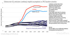
Lomborg outlines two cases, an optimistic case and a pessimistic case. In the optimistic case, Lomborg assumes that countries maintain their commitments after the target end-date lapses (as flat emissions, not reductions). In the pessimistic scenario he assumes that they do not (emissions rise in line with earlier trends).

Importantly, he explicitly disregards any mid- to long-term policies. According to political scientist Lomborg, the year 2030 is as far as policy-making can go. Yet according to the atmosphere, the biosphere, the hydrosphere, the lithosphere and the cryosphere, temperatures in 2100 are largely dependent on what happens after 2030. See our earlier Facts4Paris here for illustration of the importance of post-2030 assumptions.

Lomborg's study has an almost exclusive focus on the US, the EU and China. So let's see what his 2030 assumption means for these three countries:

  • For the US, Lomborg assumes in the optimistic scenario that after 2030, the US continues to emit at the same rate as in 2030. This ignores that the US has flagged an emissions reduction target by 2050 of 80%. In the pessimistic scenario, US emissions go into a hyper-drive increase. This ignores the simple fact that the US 2030 target will put the country on certain trajectory of change (technological, economic etc) the benefits of which should continue beyond 2030. It is non-sensical to assume that emissions will simply blow out when the 2030 deadline rolls around.
  • For the EU, in both the optimistic and the pessimistic cases, Lomborg assumes that after 2030 emissions increase. This is to completely ignore the fact that EU emissions have been steadily decreasing since 1990. It also ignores the EU's 2050 target of an 80% reduction.
  • For China, the assumption is important, because Chinese emissions represent a large share of the global total. Although China has stated that its CO2 emissions will peak by 2030, Lomborg assumes emissions strongly increase again in the period 2030 to 2050 and then stay constant until 2100. This is to ignore the fact that a peaking pledge is fundamentally a pledge to keep emissions below a certain level after some specified time. The only way this could hold, was if China kept its CO2 emission constant and ramped up its non-CO2 emissions. However, it would need to do so three times more quickly than any of the 38 no-climate policy IPCC AR5 reference scenarios suggests. They all assume that non-CO2 emissions in China will be around 2 to 4 GtCO2eq throughout the century. Lomborg's trajectory is more like 8 to 11 GtCO2eq. 

There may be other problems with the paper, but given this fundamental error in scientific judgement, we don't see the point of scrutinising it any further.


Note: Our method for producing the above graph was simply to filter all IPCC AR5 no-additional-climate policy reference scenarios with regional detail for China, trajectories for the full 21st century and data for CH4, N2O and fluorinated gases. We weighted them with the GWP AR4 metric. For the red Lomborg lines, we derived what is necessary to close the gap between flat CO2 emission from 2030 onwards and the increase of Chinese GHG emissions as postulated by Lomborg. That difference would have to come from non-CO2 emissions; and those non-CO2 emissions would have to be large. Very large. In fact, 3 times larger than any sensible model out there suggest might even occur in the absence of further climate policies.

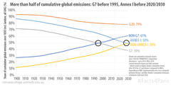
Facts4Paris: Until 1995, the G7 were the major cumulative emissions contributor but not after; and sometime in 2020-30 non-Annex I nations become the major cumulative contributors.

Cumulative Emission Shares

The industrialised countries were responsible for the majority of emissions during much of the 20th century, despite having only a small fraction of the world's population. In fact, up to 1995, more than half of all global cumulative emissions were produced by the G7 countries. 

After 1995, the majority of emissions has been caused by non-G7 countries (see the crossover point on the graph above).

For Annex I countries (the UNFCCC grouping of developed countries that includes Russia) the picture is similar. Annex I countries have been the majority emitting group, but they are on a downward trajectory and will crossover with non-Annex I countries. When that happens, more than 50% of cumulative historical emissions will have been produced by non-Annex I countries. When exactly that crossover might happen is unknown. Datasources vary and future projections are, of course, uncertain. If we simply assume constant emissions after 2014, the crossover point is 2030. If, on the other hand, we assume the INDC scenarios (in which Annex I emissions continue to fall) the crossover point is likely to be somewhere between 2020 and 2030.

If we relate climate impacts are directly to cumulative emissions, then until 1995 G7 countries were the majority cause of climate impacts and since 1995, non-G7 countries have been the majority cause of climate impacts. Similarly, until sometime in 2020-2030, Annex I countries are more than 50% responsible for climate impacts.

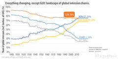
Facts4Paris: In the landscape of global emission shares everything is changing except for the G20.

G20 Emission Shares

Greenhouse gas emission shares of global emission in each year are less and less dominated by the so-called industrialised countries.

By 2014, G7 countries collectively accounted for a quarter of global emissions (see our earlier Facts4Paris), but in the old days, this was much higher. Back in 1900-1920, the G7 accounted for 70% of global emissions.

The share of current emissions from the non-Annex I countries (broadly speaking: the developing countries) is rising. Since about 1992, the share of the non-Annex I emissions has represented more than 50% of the global total, although, of course, per-capita emissions are still lower on average across non-Annex I versus Annex I countries.

Emissions from the G20 account for 76% of global total emissions, and have done so since the 1960s. This is the one constant. 

Looking at the graph above and comparing 1900 to 2010, almost all groupings have changed position....except for the G20!

For leaders gathering this week at the G20 summit in Turkey this might be a signal that they should be looking to solve the climate issue. No finger-pointing needed... all governments coming together in Antalya can do their share.

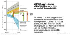
Facts4Paris: UNEP GAP report estimates 12-14 GtCO2e gap by 2030, but only half as much by 2025.

UNEP GAP half by 2025

The 2015 UNEP gap report was released on Friday just one week after the UNFCCC Synthesis Report on the aggregate effect of the INDCs was published. The numbers in the UNEP report basically confirm those of the UNFCCC Synthesis Report.

The message is the same: the gap between where the INDCs will take us by 2030 and where the world needs to be for a least-cost trajectory towards 2°C is vast: an enormous 12 to 14 Gt.

However, if we look only to 2025, the gap seems much more manageable: an approximate 5 to 7 GtCO2eq.

This suggests that in Paris we should focussing on 2025, where we can still make a difference. If we can negotiate down this gap for 2025 and treat the 2025 level as an absolute global cap, then subsequent negotiating rounds can look to enhance ambition toward 2030 with emissions peaking and starting their downward trajectory.


Note: The UNEP gap report calculates the gap as the difference between calculated INDC emission levels by 2030 and the IPCC AR5 scenario database scenarios that start global mitigation by 2020 and have a 66% likelihood of staying below 2°C by 2100. The UNFCCC Synthesis Report shows scenario trajectories and calculates the gap towards scenarios that have at least a 66% chance of staying below 2°C over the course of the 21st century, but start global mitigation in both 2010, today and 2020.

...Oh, and yes, our INDC Factsheets are one of the global studies assessed in the UNEP GAP report.

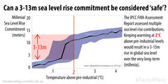
Facts4Paris: Long-term millennial sea-level rise of 3 to 13 metres follows warming of 2°C.

sea level rise

Half a degree difference does not sound like much.

However, half a degree difference in global mean temperatures is likely to mean more than a metre difference in ultimate sea-level rise.

Summarising the evidence assessed in the IPCC Fifth Assessment Report, Levermann et al. have estimated that we are committed to a sea-level rise of approximately 2.3 metres per degree of warming for the next 2,000 years. Warming of 2°C above pre-industrial levels could mean anywhere between 3 and 13 metres of sea-level rise. The upper level of this estimate would come into play if we crossed the (uncertain) threshold of the Greenland ice-sheet starting to melt. Sometime after we warm 1.2°C but probably before we hit 2°C, we could cross the Greenland ice sheet threshold resulting in about 7 meters of sea-level rise (and with current warming we've likely already crossed the seaborne West-Antarctic melting threshold).

So, when in Paris negotiations we talk about the sharing of the mitigation burden it might be good to also keep in mind that there's a lot of 'burden' associated with every half-degree of warming that we don't avoid.

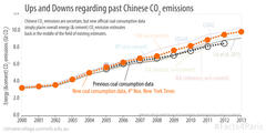
Facts4Paris: Chinese CO2 emissions may be uncertain but existing estimates are still valid.

ChinaCoalupdated

Yesterday the New York Times reported that Chinese coal consumption may be 17% higher than was previously thought. The article was picked up by other media outlets such as The Guardian and TIME. Obviously, this is not great news. But it's also not as bad, or as revelatory, as is being suggested.

Using the revised coal consumption figures to calculate Chinese CO2 emissions simply puts official estimates back into the middle of the range of what many other studies have previously calculated.

To illustrate, the above graph shows estimates of total Chinese CO2 emissions by:

  • The CDIAC, which is the Carbon Dioxide Information Analysis Center run by the US government (data includes energy and cement emissions).
  • The EDGAR, which is the Emissions Database for Global Atmospheric Research run by the European Commission JRC Joint Research Centre and the Netherlands Environmental Assessment Agency (data likely overestimates some emissions factors).
  • The IEA, which is the International Energy Agency (data excludes cement emissions).
  • The EIA, which is the US Energy Information Administration.

The graph shows that whether you choose the old coal consumption data (black dashed line) or the new coal consumption data (orange dashed line), the emissions estimates are still within the range of existing studies.

In fact, the announced revision of Chinese energy statistics is not really new (see e.g. here or here), nor does it undermine the Chinese peaking or intensity targets for Paris. On the same day that the Chinese INDC was announced in July 2015, a national expert study was published using the 2014 revised figures (see Figure 4 of Fu Sha et al). One month later, in August, a prominent study by Liu et al. revisited all the emission factors revalidating those that have been in use in China (and also suggesting that some other emission factors have been too high).

In short, there is and always has been uncertainty regarding Chinese CO2 emissions. However, the revelation by the New York Times is neither new, nor does it put the Chinese INDC into question. 


Note: To calculate the black and orange dashed lines we used an emission factor of 0.5 tonnes of carbon per tonne of coal based on the findings by Liu et al. and we adopted their best-estimates for gas, oil and cement emissions. For the coal consumption data we used the figure plotted in the New York Times article. We note that at this stage the Chinese Statistical Yearbook 2014 does not feature the upward correction that the New York Times has reported. Supplementary data made available by Liu et al. is greatfully acknowledged. PS: The figure was updated on 9th Nov. We corrected the lower 'previous coal use' emission trajectory (black circles and black dashed line), as previously we erroneously adopted the Liu et al. implicit coal use data, rather than the one shown in NYT. The emission trajectory based on the new coal use data (orange line) is unchanged.

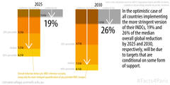
Facts4Paris: Of 'best case' emissions reductions pledged in the INDCs, one quarter is conditional on external support.

conditional targets effects

There are a couple of uncertainties in the emissions reduction targets put forward by countries in their INDCs. 

  • The first is that many of the INDCs include emissions reduction targets presented as ranges. The Australian INDC, for example, includes a target of 26% to 28% below 2005 levels by 2030. 
  • The second is that many developing countries have proposed ranges of targets that are contingent on external support. For example, the Argentine INDC includes a target of 15% to 30% below projected business-as-usual emissions by 2030. The 15% target is unconditional. The 30% target, on the other hand, is conditional on foreign finance, technology transfer and capacity building.
  • The third is that many of the INDCs are hard to quantify (this could be for any number of reasons such as a lack of data or ambiguity in the wording). 

We calculated a scenario whereby every country adopted the more ambitious extreme of its emissions reduction target range and every quantification of uncertain INDCs was resolved towards the more ambitious result. In other words, we looked at a 'best case' scenario of existing INDCs.

We found that 19% of the total emissions reduction by 2025 and 26% by 2030 were contingent on external support. 

Even in this 'best case scenario' the aggregation of INDCs is insufficient to bridge the gap to 2°C scenarios. 


Note: The gap we describe is the difference between the Cancun Pledges reference scenarios and least-cost 2° scenarios, as assessed by the UNFCCC Aggregation Synthesis Report.

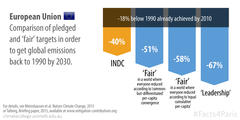
Facts4Paris: EU INDC does not meet 'fair share' nor 'leadership' criteria.

eu leadership

The EU has long been regarded a leader in international climate policy. However, with some internal voices putting up barriers (Poland, for example), this may be a thing of the past.

The EU 20% target by 2020 has basically been achieved. This is great in terms of past achievements! However, future ambitions are not so progressive.

We compared the EU's 2030 target of 40% below 1990 emission levels against various criteria (in line with our assumptions for a 2°C target):

  • In a world where everybody converges towards the same per-capita emissions level in the future (but nations with lower-than world-average emissions take some extra time to do so) the EU's 'fair' target would be 51% below 1990 levels.
  • In a world where historical emissions are recognised and thus everybody converges towards the same cumulative per-capita emissions—an approach favoured by China and India—the EU's 'fair' target is at least a 58% below 1990 levels.
  • Lastly, if the EU wants to reclaim the status of 'climate leader' in such a way that every other nation could follow the EU example (setting their own climate targets correspondingly but with their own understandings of 'fairness') the EU's target needs to be 67% below 1990 levels.

Clearly there is some way to go!

Yet there is hope...after all, the 'i' in INDCs stands for 'intended'.


Based on assumptions and methods outlined in this paper and explained in this Briefing Note.

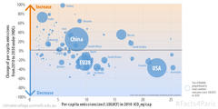
Facts4Paris: The map of per-capita emissions will change between now and 2030.

Bubble per-cap emissions

We've mapped the effect of INDCs in terms of per-capita emissions:

  • The size of the bubbles indicates total aggregate national emissions (total not per-capita).
  • The horizontal position (left-right) refers to the country's per-capita emissions in 2010—further to the right means higher per-capita emissions.
  • The vertical distribution (up-down) represents the percent change in per-capita emissions between 2010 and 2030 as outlined by the INDC—above the line means an increase; below the line is a decrease.

The big bubbles (and therefore big total emitters) are China, the EU and the US. As you can see, some of the highest per-capita emitting countries intend to increase their per-capita emissions by 2030 (Russia +34%, China +23%, Turkey +97%).

For those countries that have not submitted INDCs we assumed regional average gas-by-gas growth rates.

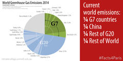
Facts4Paris: World emission shares are roughly: one quarter: G7, one quarter: China, one quarter: rest of the G20, one quarter: rest of the world.

Quarter Emissions

Although all countries have to varying degrees contributed to the causes of climate change and all countries are impacted by climate change, some countries can have more of a role in emissions reduction than others. This relates very simply to countries' absolute share of global emissions. 

While we strive for a global deal in Paris this year, it is worth recognising that a regime focussing on certain countries or certain groupings of countries might also provide a path forward. 

In 2014, the rich industrialised countries of the Group of 7 were responsible for one quarter of global emissions. China was responsible for another quarter. The remainder of the G20 countries (Argentina, Australia, Brazil, India, Indonesia, South Korea, Mexico, Russia, Saudi Arabia, South Africa, and Turkey) were together responsible for another quarter. That leaves the entire rest of the world responsible for the final quarter.

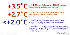
Facts4Paris: Temperatures in 2100 could be 3.5°C, 2.7° or less than 2°C warmer, depending on what happens after 2030.

Temperatures

Temperatures in 2100 depend largely on emissions after 2030—that is on what happens after the INDCs lapse:

  • If we assume "no direct connection between efforts before and after 2030", we may be set for a 3.5°C temperature increase by 2100, according to the Climate Interactive group.
  • If we assume "a similar level of effort will be undertaken by countries post-2030 as applies in the period 2020-2030", we may see a 2.7°C warming, says the Climate Action Tracker (and a report by the International Energy Agency).
  • If, however, we include all scenarios from the IPCC Fifth Assessment Report, we still have some chance of maintaining temperatures below 2°C, according to the UNFCCC Aggregation Report. This would require a 3.3% annual emissions reduction rate from 2030 to 2050 (full range is 2.7% to 3.9%) with reductions continuing thereafter towards zero emissions in 2100.

There is another alternative; it is to change the trajectory before 2030 by reviewing and strengthening the INDCs in line with a 2°C target. This would lower the required emissions reduction rate to just 1.6% per year—a much less daunting task.


Notes:

  1. Reduction rates here are measured against fixed 2010 emission levels, not against current emission levels from year to year; we think that this approach makes more sense (and the UNFCCC Aggregation Report agrees).
  2. For a full explanation of the different assumptions used by the Climate Interactive and the Climate Action Tracker, read this comparative assessment.
  3. Oh...and we'd like to mention that the climate model used by the IEA and the Climate Action Tracker to calculate the 2.7°C temperature increase is MAGICC, the model that we look after. We're glad that they have made good use of it, and you can too. It's available freely for use here: live.magicc.org.

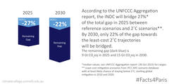
Facts4Paris: Sum of INDCs bridges just 27% of current emissions gap by 2025 and 22% by 2030.

Bridge percentage

A gap exists between all reference scenarios* and 2°C scenarios**. According the UNFCCC Aggregation Report released today, the sum of INDCs bridges just 27%*** of that gap by 2025 and just 22% of the gap by 2030.

The remaining gap (in dark blue) is about 9 gigatonnes of carbon dioxide equivalent in 2025 and about 15 gigatonnes in 2030. 


* Reference scenarios are those that "capture action communicated by Parties for the pre-2020 period and keep climate policies constant thereafter".

** Least-cost mitigation scenarios from IPCC AR5 scenario database with at least likely chance of staying below 2˚C, starting global mitigation in 2010 and 2020.

*** Median values, see UNFCCC Aggregation Report  (30 Oct 2015) for ranges.

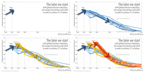
Facts4Paris: The later we start reducing, the steeper the decline to 2050.

Cancun, INDCs and 2C scenarios

Our middle-of-the-range sum of INDCs gives an approximate figure of 55 Gt of emissions by 2030 (GWP AR4 metric). This is above 2020 emission projections for both the Copenhagen and Cancun pledges. It suggests that we are heading in the wrong direction. Global emissions need to come down, not increase further, if the world is to have a likely change of keeping warming within 2°C.

Looking at all IPCC AR5 scenarios for 2°C starting in either 2010, 2020 or 2030 there is a clear penalty for delayed mitigation action. As was found by IPCC, 2050 emissions levels for 2°C compatible scenarios are 40% to 70% below 2010 by 2050. Almost all scenarios pass through that range, regardless of whether the decline starts softly in 2010 or goes into free-fall from 2031. Combining the INDC quantifications with the 2°C scenarios leaves just one conclusion: to achieve 2°C INDCs need to be enhanced...Otherwise we need a miracle emissions-reduction solution from 2031.

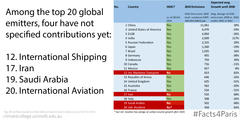
Facts4Paris: There are 16 INDCs for the top 20 emitters—those missing are: international shipping, Iran, Saudi Arabia and international aviation.

Top

We ranked all 195 Parties to the UNFCCC according to their greenhouse gas emissions in 2010 including the two main sectors that were left out of the Kyoto Protocol: international shipping and international aviation. Both of these are big emitters with rapidly growing emissions and are two of the four INDCs missing from the top 20 emitters.

In order of total emissions:

  • International shipping accounts for more emissions than the whole of the UK or Australia, yet the International Maritime Organisation has presented only a greenhouse gas study without firm targets. 
  • Iran was the 17th biggest emitter in 2010 and has not submitted an INDC.
  • Saudi Arabia was the 19th biggest emitter in 2010 and has not submitted an INDC.
  • The International Civil Aviation Organisation, the body that controls international aviation, has put forward a carbon-neutral growth pledge after 2020 (although the details and binding nature of that target are unclear, see here) but this pledge is outside the UNFCCC.

In summary, we have two countries and two sectors within the top 20 emitters for which the UNFCCC cannot quantify emissions reduction efforts post-2020. Together these four represented 4.9% of global emissions in 2010.

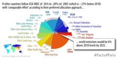
Facts4Paris: if every country matches the US pledge, in 2025 world emissions will be 6% higher than they were in 2010.

The world following the USA 2025 pledge

If countries were to choose targets comparable with those of the US (where comparabability is determined either according to a 'common but differentiated per-capita convergence' scheme or to an 'equal cumulative per-capita' approach) world emissions would be 6% higher in 2025 than they were in 2010. For a least-cost 2°C trajectory, world emissions need to be 15% below 2010 emissions, or 10% above 1990 levels by 2025. Check out www.mitigation-contributions.org to explore the outcomes of such calculations for a G20 country of your choice using different comparability approaches.

Source: See our new Nature Climate Change paper for methods and data.

Facts4Paris: There is no way around zero emissions.

Regardless of the temperature at which we want to stop global warming there is no way around zero carbon emissions. As the IPCC Fifth Assessment Report showed (and as the G7 Agreement picked up) by 2050 carbon emissions from the electricity sector have to be zero. In the middle of the second half of the century, all carbon emissions ought to be phased out to net zero and by the end of the 21st century, all greenhouse gas emissions ought to be around zero (implying net negative carbon emissions). It's a daunting task but a joint target that could not be clearer. The draft text agreement for Paris contains zero and decarbonisation targets.

Source: IPCC WG3 and Synthesis Report of the Fifth Assessment Report, available at www.ipcc.ch. Specifically, IPCC WG3 AR5 Figure SPM.7 middle panel for electricity sector emissions by 2050 and IPCC AR5 Synthesis Report Table 2.2, page 64.

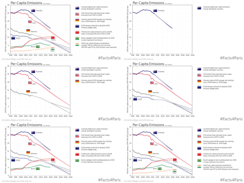
Facts4Paris: Australia's per-capita emissions remain the highest among its key trading partners

World Per-capita Emissions

We quantified fossil and industrial greenhouse gas emissions for major emitters under their INDCs using the UN 2015 revised population projections (medium scenario) to calculate per-capita emissions to 2025 and 2030. Australia remains the highest per-capita emitter in the selection of countries shown above. Chinese per-capita emissions are about the same as those of the EU28 and continue to grow under their "peaking by 2030" pledge.


Source: Own calculations. See INDC Factsheets for data sources and details.

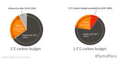
Facts4Paris: 79% of post-2011 carbon budget all used up by 2030.

#Facts4Paris carbon budget

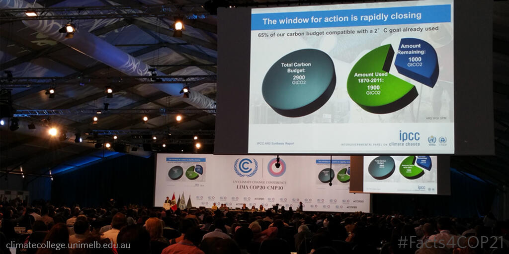
For a likely (66%) chance of staying below 2°C of warming, we can only afford another 1000 GtCO2 cumulative carbon emissions after 2011. If INDCs are not augmented, we will have exhausted about 580 GtCO2 of those 1000 GtCO2 by 2025 and 790 GtCO2 by 2030. For a 1.5C carbon buget of 550 GtCO2, the current INDCs will exhaust that by 2025.

Source: Own calculations based on our INDC factsheets. See IPCC Synthesis Report AR5, Table 2.2 for carbon budgets.

Web tools and Projects we developed

  • Open-NEM

    The live tracker of the Australian electricity market.

  • Paris Equity Check

    This website is based on a Nature Climate Change study that compares Nationally Determined Contributions with equitable national emissions trajectories in line with the five categories of equity outlined by the IPCC.

  • liveMAGICC Climate Model

    Run one of the most popular reduced-complexity climate carbon cycle models online. Used by IPCC, UNEP GAP reports and numerous scientific publications.

  • NDC & INDC Factsheets

    Check out our analysis of all the post-2020 targets that countries announced under the Paris Agreement.