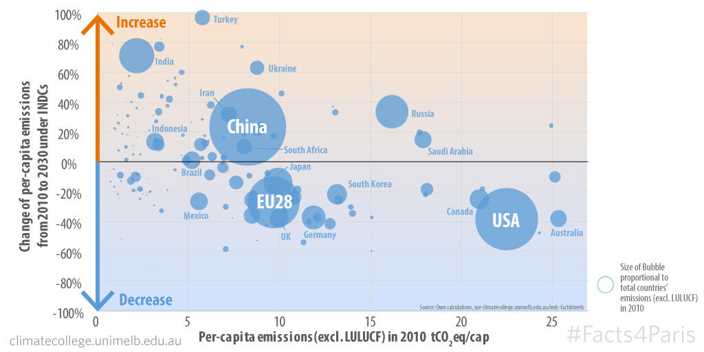
Facts4Paris: The map of per-capita emissions will change between now and 2030.

We've mapped the effect of INDCs in terms of per-capita emissions:
- The size of the bubbles indicates total aggregate national emissions (total not per-capita).
- The horizontal position (left-right) refers to the country's per-capita emissions in 2010—further to the right means higher per-capita emissions.
- The vertical distribution (up-down) represents the percent change in per-capita emissions between 2010 and 2030 as outlined by the INDC—above the line means an increase; below the line is a decrease.
The big bubbles (and therefore big total emitters) are China, the EU and the US. As you can see, some of the highest per-capita emitting countries intend to increase their per-capita emissions by 2030 (Russia +34%, China +23%, Turkey +97%).
For those countries that have not submitted INDCs we assumed regional average gas-by-gas growth rates.